The second time I fell off my bicycle, it had not been raining. It was dawn and birds were chirping. I was going downhill, the hot, humid air washing over my body. I was going faster and faster, the sky above was fast changing colors. I suddenly looked down. My bike was veering off the sidewalk. I must have pulled it back on course. The next instant my face was an inch from the rough pavement. I had skidded across the sidewalk and crashed, and my palms, fingers, and shins were scraped and bleeding. I couldn't stop staring at my hands, wishing I could reverse this.
That incident reinforced an eerie feeling I had that Tokyo has a deadly way of drawing you in; if you got too close, you would get hurt, or would no longer be able to return home. I only had two weeks left, I told myself, and I had to get off the island when the time came.
So I went home, cooked myself some breakfast, and slept. The following weekend I decided to take a break from everything else and go and visit Sensō-ji, an ancient Buddhist temple located in Asakusa, Tokyo. For someone who had mostly been preoccupied with contemporary Japanese architecture, I was surprised to see at Tokyo's oldest temple a full-blown expression of fury that I had only sensed muted beneath the white-on-white Modernism of post-war work. That made what I could only describe as the trauma latent in the serene spaces of architects such as Toyo Ito and SANAA even more potent.
Wednesday, August 15, 2012
Monday, July 23, 2012
Sumimasen, Kanazawa!
The 21st Century Museum of Contemporary Art, one of the key works of my firm, was not dazzling or grandiose, but evoked a dream-like environment.

First, because of its round plan inset with primitive forms that house galleries, and hallways connecting everything, it was strangely disorienting: not in the claustrophobic way that a labyrinth is disorienting because, at any time, you could walk to the periphery and exit to the real world through one of the many thresholds. That knowledge of safety -- like the knowledge that you can wake up from a dream and everything will go back to normal -- made me want to stay inside just a little while longer. Second, the erasure or transformation of all signs of conventional architecture -- columns, walls, doors, ceiling, etc -- evoked a childlike curiosity, but in a way that is different from the wonder of a Frank Gehry building. While a Gehry building is bombastic and obviously playful, the effect of the SANAA building was more subtle and more eerie. Even the furniture -- could you call it furniture? it was meant to facilitate human comfort -- was custom-designed. And, finally, the way the components of the building came together, neatly, painstakingly, with precision and thought, each material distinct and dignified, to meet at elegant joints, made the entire building look like a one-to-one scale model. Even the people seemed like scale figures in a rendering.
One of several traditions at the office is to fund a trip to Kanazawa for interns, as a thank you gesture. Three of us were asked on Friday if we could go Sunday. Sure, we said. And that was it. Having worked till 2 am the night before, I didn't get a chance to sleep because my journey began at 5:30 am. Jack, a Masters student at Yale, Mark, an undergraduate at USC, and I, the pseudo-American, first took the metro to Daimon station, then took the monorail to Haneda airport, then we took an hour-long flight to Kamatsu, then an hour-long bus ride to Kanazawa city, and finally -- because the relentless scorching sun wouldn't let us walk -- a cab to the museum itself. By the time we got close, hot and exhausted, I was thinking this better be worth it.
A blast of air-conditioning welcomed us into the unsustainable but beautiful glass container. As Sejima san and Nishizawa san had boasted during their talk at the GSD last year, the building does indeed make the common public feel welcome and at home, allowing them to wander many of its spaces, sit in its seats, and sleep on its comfortable rug-topography-thing without paying a fee. And the fee, too, is small compared to other museums of this quality.
There were some disappointments: the bookstore was the exact same concept as its counterpart in the New Museum on the other side of the planet; there wasn't much sectional drama, no moments where the distinct galleries influenced one another, and no curated pathway. Perhaps by releasing all control and freedom to the museum-goer -- a political gesture from SANAA? -- the architects did overturn Wright's regimented scheme of the Guggenheim. As a result, they sent visitors on an aimless, wandering excursion where, like in a dream, you come upon a huge room after you thought you'd already seen everything, or you encounter a room you've visited before and begin, on second reading, to grasp the irony of the artwork, and begin to be either more critical or more reverent, or just more indifferent... but never fear, there are other treats like the pool to keep you entertained.
 |
| Tokyo that morning; waiting for Jack and Mark at Daimon Station |
 |
| The drop chair, designed by SANAA. We have a couple of these in the office. |
 |
| A mistake? Unlikely... |
 |
| We took two long naps here. |
 |
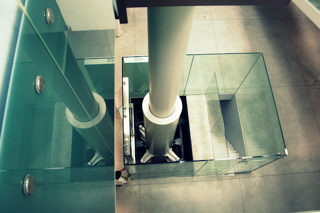
| A thin layer of water is supported on the glass above this dry room, creating the underwater illusion. |
 |
| The look of who-do-you-think-you-are-making-fun-of-Japanese-architecture is priceless. The irony is: Mark is helping to design SANAA's next great work. |
Subscribe to:
Comments (Atom)


